
Single Metric Time Series
With time series data, your audience is most often interested in understanding a trend over time or in looking at what happened at a specific point in time (e.g. a spike). In the simplest case, we are looking at a single metric and a basic line chart is most commonly used.
One problem with the basic line chart is that day-to-day fluctuations can make it difficult to discern trends. To solve this problem, it is useful to combine the daily time series data with a rolling average over a longer period of time. The rolling average helps to smooth out the daily fluctuations and reveal the trend more clearly.
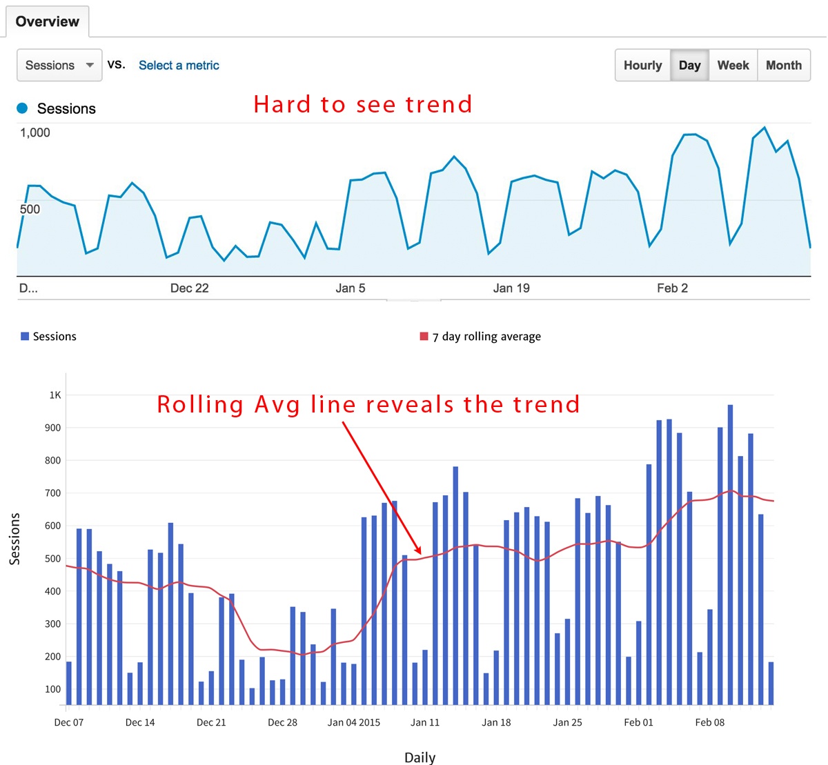
These two time series charts show the same data – Daily Sessions – over the same period of time. The chart on top is taken from Google Analytics; the lower chart, which includes the 7-day rolling average (red line), was produced by Megalytic.
Both charts show that Sessions (or website visits) fluctuate on a weekly pattern (dropping off on weekends) and that the average is generally increasing as time goes on.
However, the key drawback of the top chart is that you cannot tell what the daily average is for Sessions or by how much it has improved. By including the 7-day rolling average, it gives you an average daily value for traffic and clearly shows how it is changing over time.
In the lower chart, we see that December started with around 500 Sessions per day, dropped way down during Christmas and New Year’s, and by early February was running close to 700 Sessions per day.
Of course, you can achieve some of the same benefits by graphing the data weekly and not including the rolling average, but you lose two important pieces of information. First, you no longer have a visual representation of the daily average. Second, you no longer communicate the weekly fluctuation in traffic for this website.
The examples below use the Megalytic reporting tool to generate data visualizations. To follow along and create the same charts with your own data, sign up for a free trial (no credit card required).
Single Metric Time Series – Segmented by Dimension
A key technique in web analytics involves segmenting data along different dimensions to gain insight into what is driving the changes. For example, you may want to segment Sessions by Acquisition Channel to determine if traffic growth is coming from Organic Search, Social or somewhere else.
But, what is the best way to visualize time series data segmented by dimension? In truth, there is no one best answer. It depends on your audience and what point(s) you want to emphasize.
Suppose you want to show the audience how much each segment has grown or shrunk over time? Then, a basic line chart like the one below may be best.
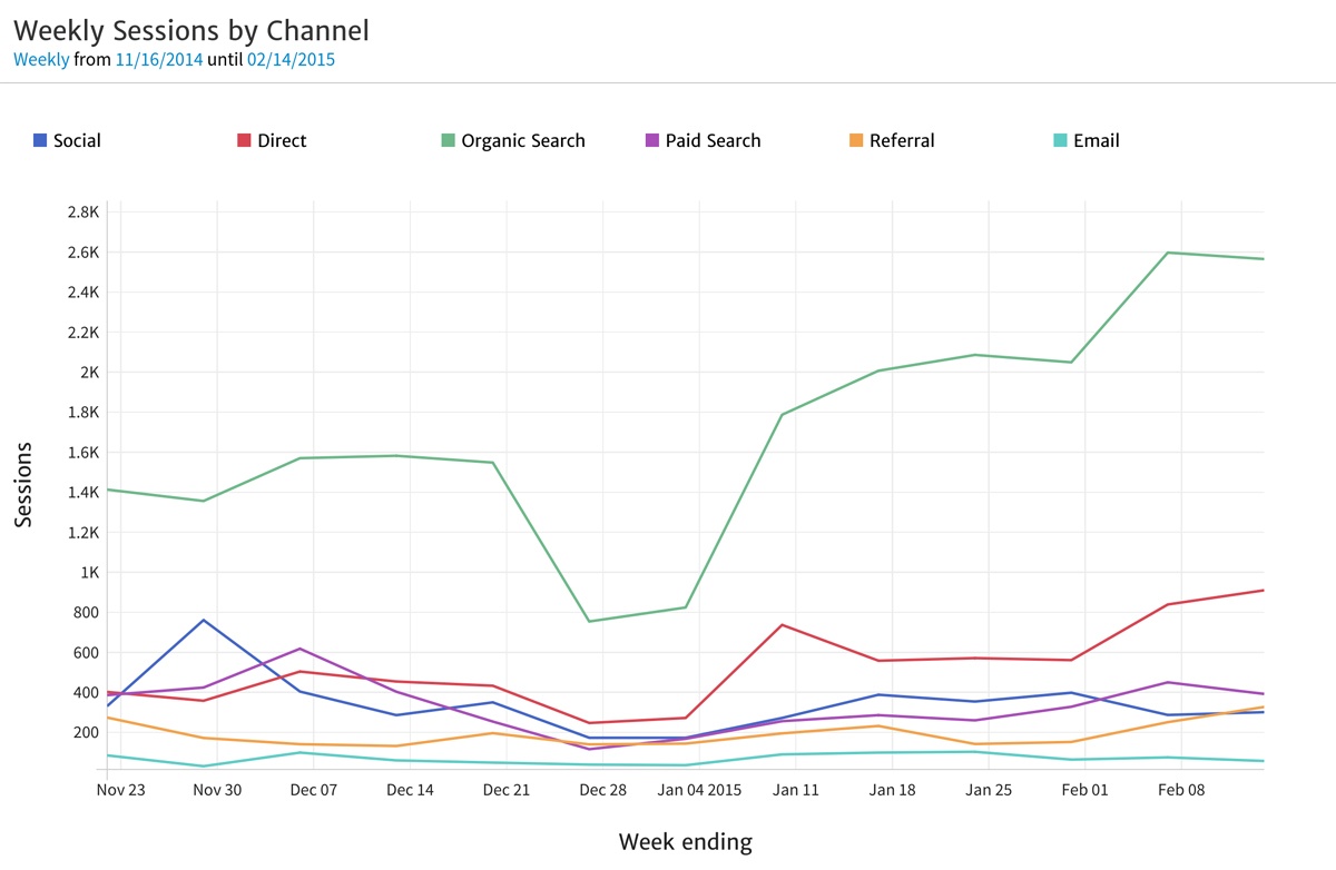
Here, you can see clearly that Organic Search contributes the most traffic and that it has grown from about 1.4k to 2.6k weekly sessions. One difficulty with line charts like this is that once they have more than three series, they begin to look cluttered and confusing to the eye. In this case, we have six lines; that is about the maximum you can have and remain readable. As an alternative, you may opt to render the same data as a time series bar chart. As shown below, this can make it a bit easier to make sense of all six dimensions.
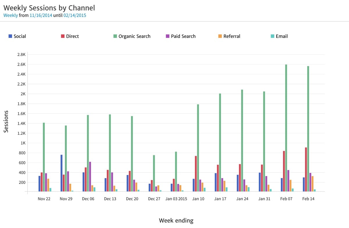
Whichever you choose -- the line series or the bar series -- what you cannot easily comprehend is the relative contribution of each channel to the whole and how it has changed over time.
The area time series chart can help show how the total breaks down across the dimensions and how the breakdown has changed over time. This chart is similar to the line chart, except that each line has the area underneath filled in and the lines are stacked on top of each other, so that the top line is showing the total.
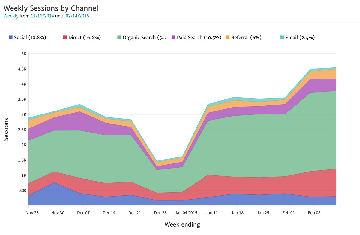
With this area chart, you can see that Organic Search is not only the largest, but that it is significantly larger than the other channels. You can also see that the total traffic has increased from just less than 3k sessions to slightly more than 4.5k sessions.
This helps us to see how the individual channels stack up to produce the total traffic, but it is tough to see how the shares are changing. For example, Paid Search seems to represent a smaller percentage of the total traffic than it used to, but by how much has it changed? It is not visually apparent here.
We can change that by normalizing the Y-axis to show the Percentage of Total Sessions instead of the actual sessions.
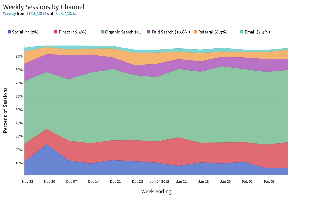
With the data normalized, we can more clearly see that the contribution of Paid Search has shrunk relative to the total number of Sessions. In late November through early December, the purple band is much thicker than in early February.
Conclusion
As the examples above illustrate, how you visualize data is nearly as critical as what data to show when communicating information to your team. When deciding upon the best way to represent your website data, keep in mind the point(s) you are trying to get convey. For example, if you are working with segments and want to emphasize the size of each individual segment, a line chart will help you see growth over time. If you want to show the actual size of each segment within the context of how it contributes to the total, use the area time series chart. And if it is most important to show how the percentage contribution of the segments has changed over time, use the area time series together with a Percentage on the Y-axis.
Thankfully, Megalytic provides a variety of charts and tables to help marketers represent data in a clear and impactful way.
Next in our series about data visualization, we’ll cover aggregate data for fixed time periods and delve into dimensions and segmentation.
This is the first post in a three-part series where we break out common analytics reporting situations and identify the best approaches to representing the data. Here, we have looked at how to visualize time series data. Part II examines segmenting data for a single time period. Part III looks at how to best present data to compare performance across time periods.

