Customizing by Dimension
For example, you may choose to specifically show countries (and not Google Analytics’ Region dimension, which includes states/provinces for national brands and countries) in cases where the business has international customers. You can do this by going to the widget options (gear symbol in the upper left) and using the Dimension dropdown to make your selection.

Within this dropdown, you can choose to display any of the following dimensions:
- Continent
- Sub-continent
- Country
- Region
- Metro area
- City
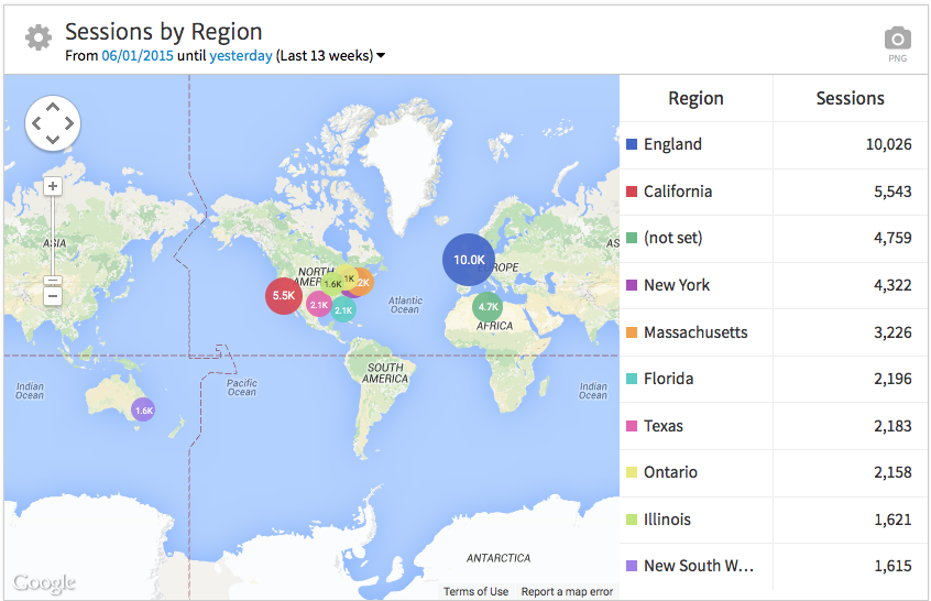
Also, you may have noted in the initial screenshot that Sessions from (not set) were third on the list of locations. These include any visits for which Google Analytics was unable to determine a geographic location. If you only want to show data for cases in which the location was known, you can exclude (not set) Sessions by unchecking the box next to Include (not set), right below the Dimension dropdown. Now, you’ll see a list restricted to identifiable locations.
Filtering & Choosing Metrics
Next, you may want to limit data to within a particular country. For example, if you only do business within Canada, you’ll only want to show traffic from Canada. Use the Filter dropdown to select the continent, sub-continent, or country you’d like to show.
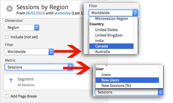
You can change the metric you’re choosing by using the next dropdown. If you’re looking at the volume of potential new customers viewing your website, New Users may be better to show than Sessions. You can choose from most metrics available in Google Analytics here.
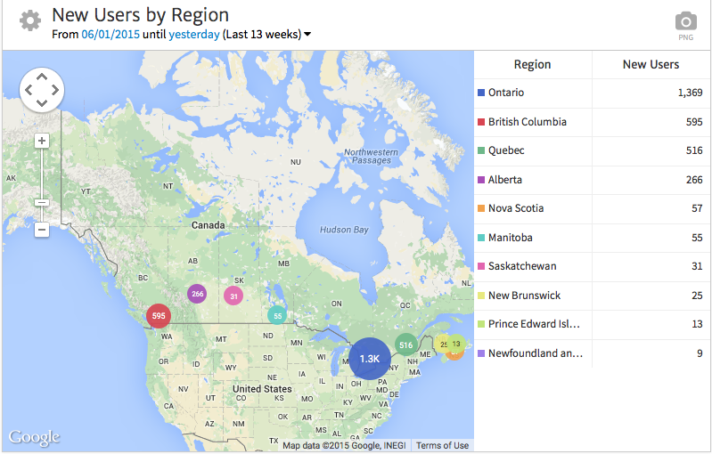
Now, note that the map updates to zoom in around Canada, with stats breaking down New Users by province.
But what if you want to break out data more specifically than what’s available in the default filtering options? For example, maybe you run a local business only servicing select towns within New York State. Here, you’ll want to filter data to just New York. To do so, you can use the built-in filtering option available for most Megalytic widgets!
Within the widget options, click “Show filter” at the top. Now, add a new filter, choose to filter by “Region/Exactly Matching,” and enter “New York” in the text box. Apply the filter to update the report.
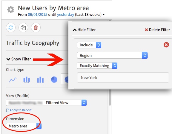
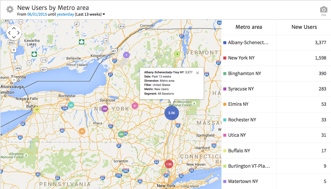
Finally, update your dimension to reflect a more granular area within the state (metro area or city, depending on how specifically you want to show data). In this case, we’ll choose metro area, since this data shows performance for a business that services multiple metro areas around the state.
Now, you’ll see that the final widget zooms in even further to look specifically at New York. Metro areas are marked on the map, as well as broken down by New Users in the right-hand table. Note that you can click on any location on the map to see more details about its performance (the Albany-Schenectady-Troy metro area is currently selected in this example).
Changing the Chart Type
While the map offers a handy way to visualize geographic performance for your business, you may want to show data in a different format. For example, you may want to compare form conversions by geographic area between two time periods, a case for which a bar graph would prove helpful.
To customize the chart type you’re using, simply select from the row of icons near the top of the widget options. You can choose from the following options (left to right):
- line chart
- time series bar chart
- standard bar graph
- pie chart
- map (shown previously)
- table view
- table graph
For this example, we’ll choose a standard bar graph. We’ll also customize the date range to compare data to the previous period. Finally, we’ll use the Metric dropdown and choose Completions to measure total Goal Completions for each metro area.
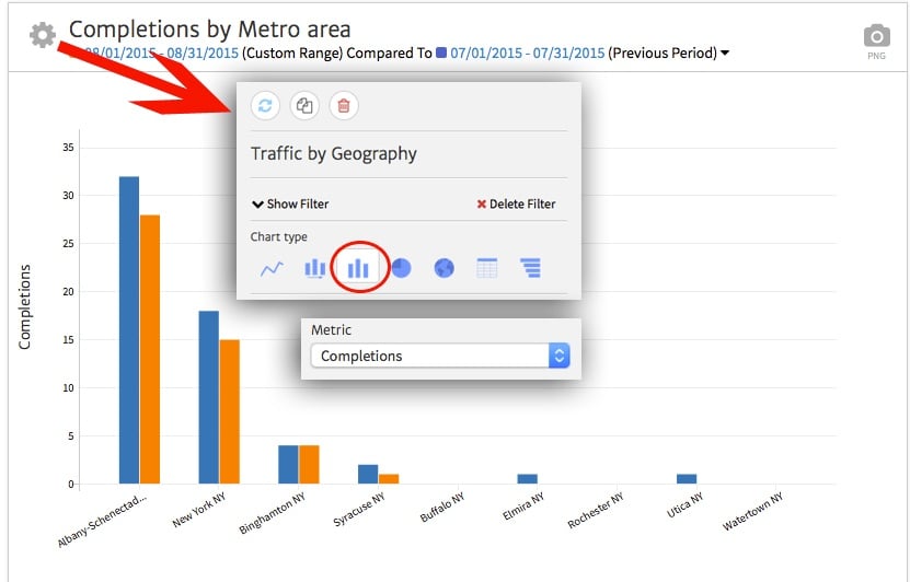
In the final example, we see a graph breaking down Completions by metro area, comparing data from one month to the previous month. This way, we can easily show whether website inquiries have increased or decreased over time for each area.
Showing Data in a Table
Perhaps you want to show multiple stats all in place for each area. For example, you want to show visit totals (Sessions, New Users) alongside engagement data (Avg. Session Duration) and conversion data (Completions, Conversion Rate). In this case, a table comes in handy to break down more than one metric by area.
From the widget options, choose the table symbol to change the chart type. Next, choose the metrics you want to show from within the Columns dropdown. Click each desired metric or dimension to add a checkbox next to it, showing in the widget (click again to uncheck). Once you’ve chosen all the metrics, select Apply to Report to update the data.
[screenshot: table]
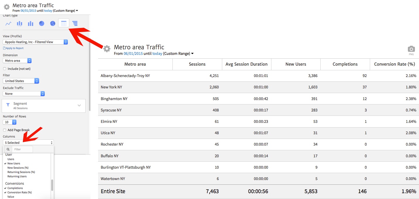
In the final table, you can now see data broken down by metric/dimension in each column, along with totals in the bottom row.
Conclusion
For any business concerned about its geographic reach online, the Traffic by Geography widget offers many powerful ways to show data by area. You can show a map to help visualize performance of top locations or change to a graph or table to show more specific performance information. In addition, you can customize the widget to show just the metrics you want and filter to the geographic level most relevant to your business (from the whole world down to a select metro area).

