
Compare Date Ranges
 Showing clients a list of numbers for one month’s statistics will tell them how many people came to the site that month and what they did. But without context from past months and years, this data tells them nothing about whether the number of users increased or decreased, or whether the conversion rate went up or down. Comparing data to previous time periods shows a client if improvement is taking place and offers perspective to the numbers they’re now viewing.
Depending on the business, you may want to compare data to the past month, past year, or both. If your business model is seasonal (say a ski resort that sees traffic increase as winter approaches), you’ll likely find more value in comparing data to the same timeframe of the previous year. You can identify if you’re receiving the same volume of traffic and leads or if you need to step up marketing efforts to improve.
If you run an ecommerce site that sells steadily throughout the year, you may want to compare data to the past month to see how profits have gone up or down. You may also find it useful to track how you’re doing compared to the last year, especially as peak buying times like holidays approach.
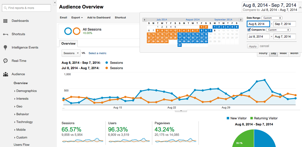
Luckily for marketers, Google Analytics lets you easily compare date ranges. Just click the date selector in the top right, check the “Compare to” box, and select the date range you’d like. Once you click “Apply” you’ll see the graph and metrics show stats for both ranges.
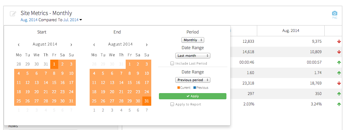
If you’re using Megalytic for reporting, you can also easily compare date ranges within a number of widgets. For example, the “Period Comparison Table” widget shows stats and percentage changes for the date ranges range of your choice. Here we’ve added the widget to a report, and given it the title “Site Metrics – Monthly”. Now we just click the dropdown by the dates at the top of the widget and select the months you’d like to compare.
Explain the Data
Anyone can export a PDF from Google Analytics and email it to a client. However, a PDF of graphs and numbers means little to the average business owner or head of marketing without explanation. Immediately, they’ll think of questions about the reports they see. How do the numbers relate to their business profits? Should they be concerned bounce rate has increased and shows up with a red font that screams “warning?”
Your job, either as an agency or in-house analytics professional, is to explain what the statistics mean. Using a reporting product like Megalytic allows you the advantage of adding comments within the report so it shows more than just numbers, percentages, and graphs but actual explanation and insight.
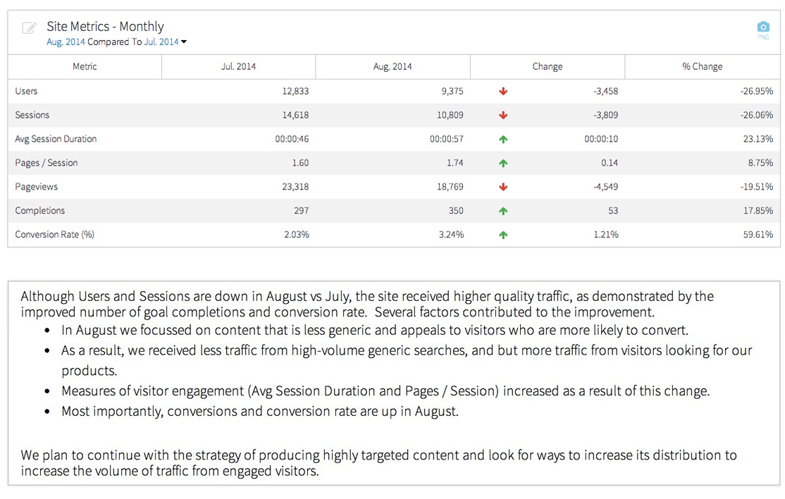
For example, let’s look at a table created by Megalytic's Monthly Site Metrics widget. Reviewing the statistics, we can see sessions and users went down from the previous month. This decrease would immediately flag concern for a business owner who is worried that fewer people are seeing their brand.
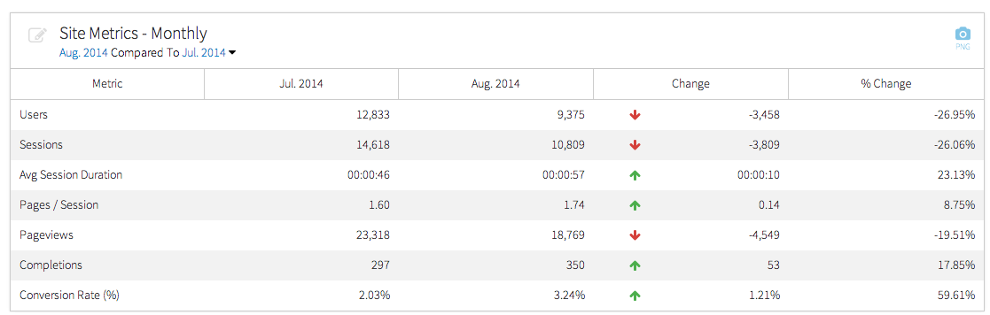
However, a closer look at the stats reveals that while the volume of sessions decreased the volume of conversions increased - along with an improved conversion rate. In addition, those users who did land on the site spent more time and looked at more pages.
Digging even deeper into analytics reveals information not immediately apparent from this widget. While data shows exceptionally high traffic in July, much of the increase in visits came from a few blog posts ranking for high volume terms. However, these terms were not immediately relevant to customers looking for service.
All this information helps guide a client or boss to look beyond surface statistics to understand the actual state of the website’s performance. In order to ensure whoever reviews the report understands the context and explanation behind the numbers, add a comment in the report explaining any potential concerns and pointing to what you consider positives and negatives.
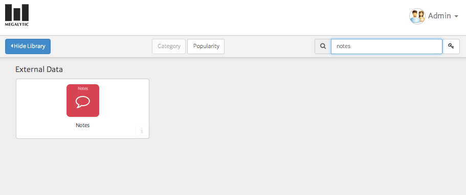
If you use Megalytic, you can easily add “Notes” widgets throughout your reports. Just select “Add Widget” and search for “Notes” to find this widget. You can then add whatever copy you decide to write up, ensuring your client or boss reviews the report with your reasoning and these insights in mind.
Here is what the Monthly Site Metrics table looks like together with a note positioned below it.
If you’re presenting a report to a particular person for the first time, or expect people who are completely new to analytics to review the report, use Notes to also define metrics. For example, realize the average person won’t automatically know the difference between users and sessions or understand what bounce rate means. You don’t want to overwhelm them with an arbitrary list of stats, so be sure to explain as much as possible.
For more thoughts on answering concerns from business owners, see our article on Translating Web Analytics Requests.
Segment Data by Source
While a report should include a big picture view of site traffic, you should also show traffic, engagement, and conversion broken out by source. Since each channel differs in volume and performance, break out organic search, paid search, display advertising, social media referrals, and other key sources. For example, you may see a low conversion rate overall but find that sessions specifically from paid search are converting well. You may also want to identify which channels drive the most lead volume.
The Completions by Traffic Source widget in Megalytic uses channel groupings from Google Analytics to show where conversions originated. Ultimately, this widget helps show whether leads came from organic search, paid search, social media, email marketing, etc.
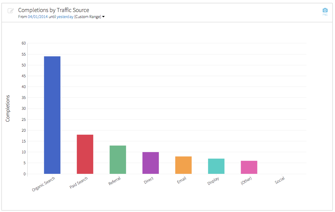
From this chart, we can see that organic search has driven the most leads for this particular site, by far.
Show ROI, Not Just Traffic
Your reporting should point the reader beyond just looking at how many people came to the site to determine what kind of return the website provided for the business. In order to do this, you’ll want to show any data that points to return on investment, such as leads submitted, goods purchased, and resources downloaded.
Be sure to add in data about goal completions and conversion rates on top of sessions and users wherever applicable. The Completions by Traffic Source report shown previously provides a good example. In addition, if your site sells goods via an ecommerce setup, show data on purchase volume, revenue, and shopping cart behavior.
You want your client or boss to see how much value the website provides through SEO, social, and paid advertising efforts driving people to the site. Identify the statistics most vital to revenue for the company and report those through analytics.
Conclusion
An effective analytics report is one that communicates beyond arbitrary figures to actual business success. Understand your client and the metrics that matter to the business. Explain metrics that may not be readily understood. You deserve to get credit for work done on the web, but you need to be sure to properly communicate the work completed and successes seen through the data at your disposal in analytics.

