Why Analyze Website Traffic by Time?
Looking at analytics on an hourly level allows you to pick up on micro trends that occur over time. This can help you answer important questions, like when are people most likely to visit your site? Or, when are the quietest times on your site? This can help you plan events such as flash deals or scheduled site maintenance.
Looking at data on a daily level allows you to pinpoint times of the month or week when people are most likely to land on your site. For example, at Megalytic we often find people searching more heavily for an agency reporting solution at the beginning or end of the month, when they’re most likely to be creating client reports.
Identifying Trends with the Graph
You can use the graph in any Analytics reporting view to pinpoint trends in performance over time. For instance, this graph from an HVAC company shows how interest spiked during an exceptionally cold portion of January. For the most part, this winter had mild weather, apart from a drop in temperature around the third week. The spike correlates to people searching for heating repair due to furnace issues during extreme weather.
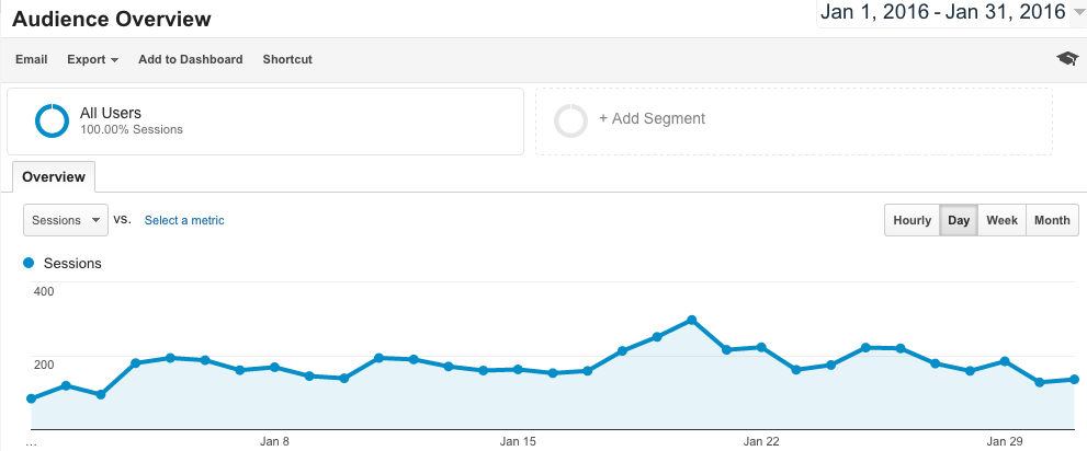
To ensure that you can remember important mitigating factors like seasonal events, make sure to add annotations to your Google Analytics graph. For instance, you can comment that the weather during the period of the spike was exceptionally cold, resulting in more heating service calls. When looking back several months later, or working with a new employee or agency, everyone can easily correlate the spike with the weather based on your annotation.
Next, switch the graph to “hourly” to look at data on an even more granular level. In this example, we see site traffic around a 3-day time-frame, with an email newsletter being sent on the second day. The first day shows average traffic over the course of the day. The next day, when the newsletter went out in the morning, you can see traffic spiking up to a high point at 9 AM, remaining above average over the course of the day.
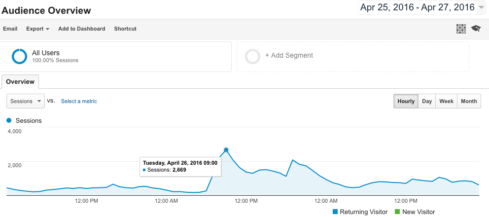
Note that, as we’ve done here, you can mouse over any point in the graph to see the time and number of sessions (or whatever metric you’re looking at) for that hour. You can actually watch this kind of response to newsletter content over the course of a few newsletters to see if there is a particular point in the day where users are most likely to click through. This can help you time your content more effectively.
Using a Secondary Dimension for Time
If you don’t use secondary dimensions in your analysis, now is a great time to start. They are particularly effective in helping you get a more in-depth look at how people are accessing your site. Essentially, these dimensions allow you to segment data on a more granular level. For instance, you can look at not only total traffic by source but also break down traffic levels by day of the week for each source.
For example, let’s break down Google organic search traffic by day of the week to see what days searchers are most likely to come to an HVAC company’s website. Here, we’ve navigated to Acquisition > All Traffic > Source/Medium and selected google/organic from the list of sources.
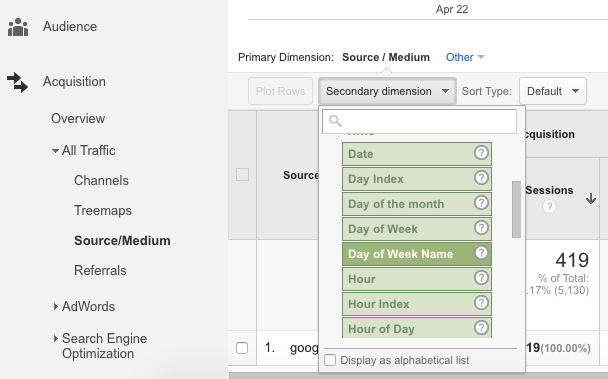
To segment by day of the week, select the Secondary Dimension dropdown just below the graph. Choose Day of Week Name from under the Time category. Day of Week alone will show numbers corresponding to days, as opposed to Sunday, Monday, etc.
.png?width=992&name=organic-days-of-week%20(1).png)
The final chart will show organic traffic broken down by day of the week. You can click the header for any column to sort. Here, we’ve chosen to sort by New Users to see what day drove the most new visitors from organic search. With this view, we can see that Monday shows the highest volume.
Logically, people who have problems with HVAC systems seem likely to look for a service professional on the first business day of the week. With the weekends showing the lowest volume of activity, this surge on Monday makes even more sense in that context.
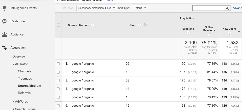
Now, let’s analyze what time of day people are most likely to search and land on the site. To do that, we’ll head back to the Secondary Dimension dropdown and select Hour. The number correlates to the hour of the day (01-24).
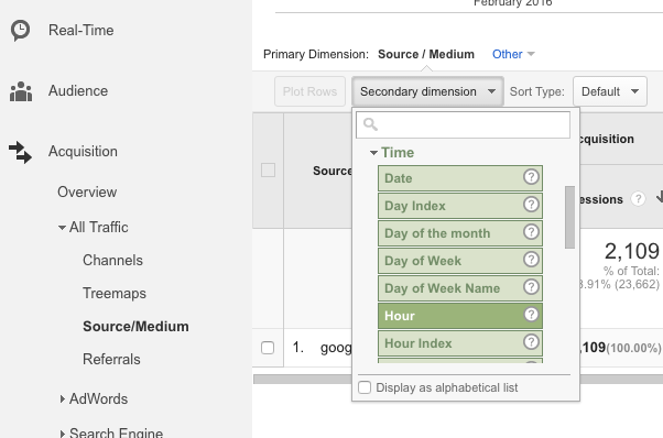
Here, we see that the top hours for people coming to the site are within the 8 AM-11 AM range, showing that people are most likely to search for HVAC issues at the beginning of the day. Based on the time-frame, the data suggests that people are likely to be searching while at work.
Creating a Custom Report
To analyze overall hourly traffic to your site, you can create a custom report that shows a table of metrics broken down by hour. For this example, we’ll look at hourly trends for a wellness blog. To start, click Customization in the top navigation bar. On the next page, select the New Custom Report button.
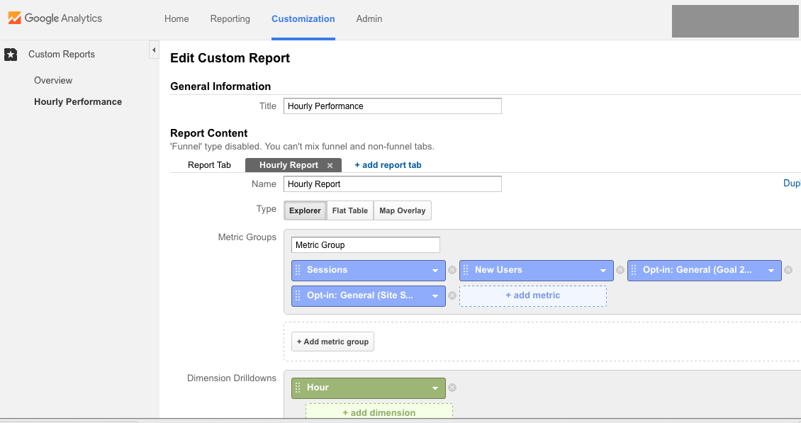
Now, you’ll see a screen where you can choose what metrics and dimensions you want to appear in your report. Under Metric Groups, we’ll choose Sessions and New Users to gauge total traffic. In addition, we’ll select total completions and conversion rate for an email opt-in goal. Under Dimension Drilldowns, choose Hour.
After customizing all of the metrics, save your report to see the final version. You’ll now see hourly data averaged across the entire date range you’re viewing in Analytics.
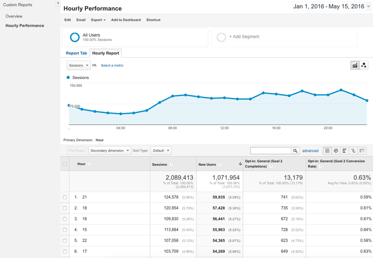
We can see that user volume begins to pick up around 7 AM, maintaining steady volume throughout the day but gaining more momentum toward evening and peaking around 9 PM. Conversion volume seems to roughly correlate with traffic volume.
Based on this data, we can determine possible times to test publishing a post and beginning to promote it on social media. For instance, promoting a post in the evening may get it in front of the most people likely to click through and read.
 Conclusion
Whether analyzing daily trends by source or looking at hourly performance, breaking down data by time can help you to identify trends in your website’s traffic. Look for the impact of seasonal factors like weather, as well as identifying special events that may have triggered people to look for your site at a particular time. To dig further, create custom reports to more closely analyze data by time.
Ultimately, long term data and recurring patterns will help determine a lot of initiatives and new campaigns. For some things, the devil is in the details, and thanks to Google Analytics, so is the data.
Micro trends can help drive marketing decisions relating to time and day. They can help determine the best times to send out an email newsletter or help you decide when to publish new posts or promotions.
But as with anything in digital life, the learning never stops. Always continue to test and evaluate this data as it changes over time. Everyone loves big ideas, but these are the tiny insights that can truly guide the refinement of your online marketing processes.

