- Which campaign generated the most sales last month?
- Did the new checkout design reduce abandoned carts?
- Which acquisition channel is doing the best job bringing in visitors from our target demographic?
- How does the conversion rate for the latest Twitter advertising campaign compare with the one we ran last month?
- Is the new AdWords remarketing campaign contributing more to sales than it costs?
Dashboards are like Scoreboards at a Baseball Stadium
A web analytics dashboard is like a scoreboard at a baseball stadium. At a glance, you can read it and understand a lot of vital information about what is going on. Which team is winning? What is the score? Have their been any errors? What inning are we in?
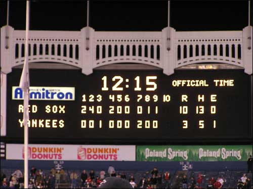
That’s the scoreboard at Yankee Stadium at the end of Game 7 of the 2004 American League Championship Series. The year that the Red Sox came from behind in the series 0-3 to win the next four games and then go on to win their first world series since 1918.
I remember watching that game with my then-4 year old son. He became a die-hard Red Sox fan, which has been tough since we live in the suburbs of New York City!
You can learn a lot from that scoreboard:
- Red Sox won 10-3
- The Red Sox were ahead the entire game.
- The Yankees committed an error.
- The Red Sox out-batted the Yankees 13 hits to 5
But, you cannot tell how the Red Sox won. What strategies worked? Who were the key players? Was the Yankees pitching really bad, or were the Red Sox’s batters on fire in the early innings? Etc., etc.
A Google Analytics dashboard is a lot like that scoreboard. It will give you a good idea of what has been going on. It can alert you to any problems (e.g., traffic is way down) or let you know when things are going really well (e.g., Ecommerce sales are way up).
But, also like that scoreboard, a dashboard is a single page. It cannot provide enough data to answer the deeper questions like, “Which campaign is driving the surge in Ecommerce and what products are people buying?”
Granted, a well-designed dashboard can be set up to answer some of those questions – but the problem is there isn’t enough real estate on a dashboard to answer all the questions, all the time. And the questions keep changing, along with the website, season and marketing tactics.
Reports are often a better tool for answering all of those why questions.
Reports are like the Post Game Analysis
If you need to understand how the Red Sox won Game 7 (or how the Yankees lost), you need to read the post game analysis. There, you will find facts and figures combined with text that interprets the events.

You can read the full post-game analysis here: 2004 ALCS Game 7
In the post-game analysis, you’ll learn that Derek Lowe pitched the game of his career after having a miserable regular season. You will also find out that Johnny Damon – who had been 3 for 29 going into game 7 – hit a grand slam in the 2nd inning and a two-run homer in the 4th.
A good Google Analytics report should be a lot like the post-game analysis. It will tell you which campaigns were the key contributors to success. There will be text to describe why the Facebook campaign isn’t reaching the 18-26 female demographic it was expected to appeal to. And there will be numbers, charts and graphs to back up the points.
The key difference then, is this:
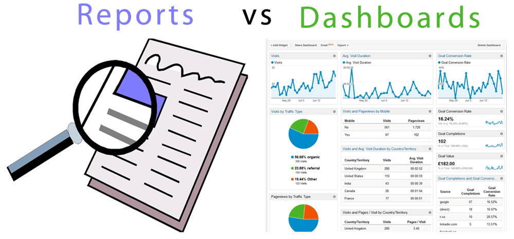
Dashboards show results. Reports tell a story.
When to Use Dashboards
Since dashboards show results, they are most useful for keeping your key performance indicators (KPIs) top of mind across your organization. Which are the KPIs that your entire marketing department needs to be on top of? Maybe stats such as:
- New subscribers vs target so far this month
- Average Order Size (AOS) for ecommerce transactions this week
- Sessions this week vs same period last year
A dashboard provides vital statistics that the marketing organization needs to know in order to tell whether they are meeting their objectives.
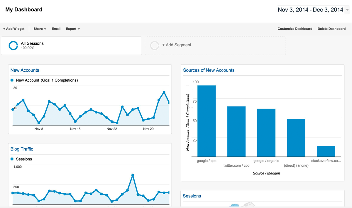
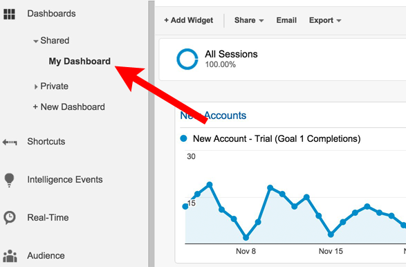
Google Analytics has a pretty decent dashboard builder. Below is an example of one that I use to keep track of some Megalytic KPIs like New Accounts and Blog Traffic.
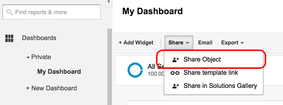
One of the most useful features of Google Analytics Dashboards is the ability to share them with other users. When you first create a Dashboard, it is private to you. But, by selecting “Share Object” from the Share menu at the top of the Dashboard, you can make it public so anybody logging in to the Google Analytics View where you created the dashboard will have access to it.
Once you have shared your Dashboard, it appears under Dashboards > Shared.
There are, however, some limitations to Google Analytics Dashboards. First, they require the user to have access to Google Analytics. Some organizations need to restrict access to Google Analytics for security or confidentiality reasons. So, if your organization is not comfortable with everybody having access to Google Analytics, then this isn’t the right solution for broad sharing of analytics data.
Secondly, you may want to include other data, besides just Google Analytics, in your dashboard. Maybe revenue numbers from your payment system. Or statistics from social media, such as likes, retweets, etc.
In those cases, you might want to explore third party dashboard tools. A couple that have impressed me are GeckoBoard and DashThis.
When to Use Reports
Reports tell a story with data and words. Use reports when your audience needs to get into the why of the results to make decisions about what to do next – either building on past success or abandoning a failed campaign to try something new.
Not everybody needs the same story. The content marketing folks want to hear the story about which content types drive engagement and where the engaged visitors come from. The PPC advertising people want to hear the story about which campaigns produce the most revenue (or generate the most leads) for the lowest cost. The web design folks want to hear the story about the impact of the redesigned navigation on the conversion funnel. Everybody has their own money metrics.
Telling those stories – and providing the insight needed for decision making – means combining data in charts and tables with commentary to interpret the data. Reports like these might run 2 – 10 pages, depending on how in-depth the analysis needs to be.
Below is a snippet from a report. Notice the use of a map to show the locations where online hotel reservations are coming from, together with text that explains the significance of the data. This part of the report is telling a story about the surge in reservations coming from the UK.
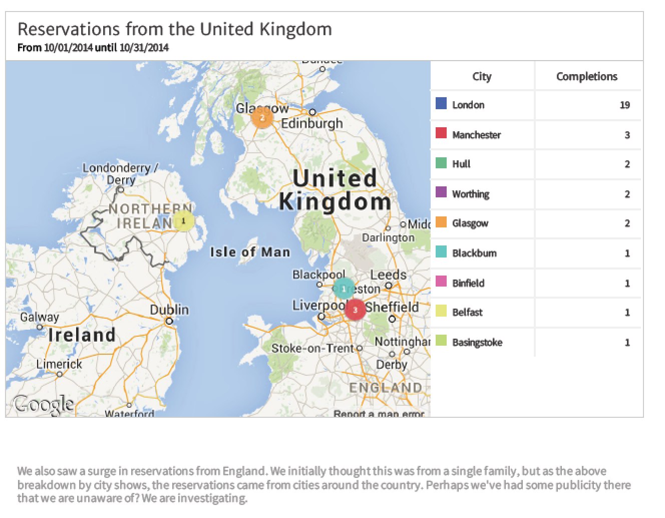
You can download the full report here: Downing Bay Hotel Website Report.
There is no way to create reports like this in Google Analytics. Traditionally, people have cut and pasted Google Analytics charts and tables into a word processor, or exported data into a spreadsheet, and pulled everything together into a report manually.
Now, however, you can use Megalytic to automate the process of creating these reports. Megalytic enables you to set up reports for various audiences (e.g., Content Marketing, PPC Advertising, Web Design) as templates. The reports built from these templates are tied-in directly to your Google Analytics account and the data, charts, maps, graphs, etc. – can all be updated automatically each month or week.
For more detail on how reporting with Megalytic works, see this blog post: Google Analytics Report Templates for Automating Monthly Reports.
Conclusion
They key to achieving a data-driven culture is distributing data to your organization in a manner that is tailored to the decision-making needs of your various constituencies. Dashboards are best for keeping people focused on a set of KPIs that measure success. Reports are best at providing the analysis needed to support informed decision making. Most organizations need both.

