
Showing Goal Performance
When marketing for a college or university, the first step is to identify your goals and to pinpoint the indicators you’ll use for measurement, just as you would for any other organization. For example, a college ultimately wants to get more students enrolled in classes, so online application submissions would be a major key performance indicator (KPI) related to increasing the student population. But additional goals may include getting people to request information via a contact form, downloading a course catalogue, signing up for a newsletter or registering for an open house.
To report on these goals, you’ll need to be able to clearly and concisely present figures on how many people converted and where these people came from. To do that, we’ll add the Conversions by Channel widget.
First, you will need to customize the widget, clicking the gear in the upper left to get to the options. Using the Goal dropdown, choose the specific Goal that you’d like to track. For this example, we’re going to take a look at Event Registration, which correlates to prospective students and parents who sign up to visit a campus open house.

The graph showing open house signups is broken down by channel. This helps us see how people who signed up for the event are coming to the site. The chart shows that the majority of people who registered for an open house came from Direct visits. Next, we can see that organic search drove a substantial number of signups, followed by paid search. Finally, we can tell that social and referral channels barely contributed at all.
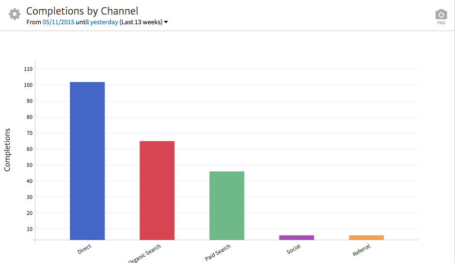
From this data, we can draw a few important conclusions. For instance the strong showing in the direct channel indicates that a recent direct mail campaign designed to drive users to the website to sign up for the open house was effective. The number of organic signups suggests that there is a strong organic positioning in search that is driving quite a few users. In addition, paid search managed to drive a decent number of leads, validating an existing spend in this channel.
However, we can also identify an opportunity to improve social media outreach to students around open house events, as social channels failed to generate significant leads. In theory, social media should be an effective avenue for reaching college-age prospects who may be in the stage of researching a school to attend. So this begs the questions, “Why is this prime channel failing to generate open house signups, and what can we do differently?”
Showing Traffic to Key Pages
You can, of course, include overall traffic in your reports. But ideally, you want to focus on traffic to pages that most relate to specific marketing goals. Data for the site as a whole may be inconclusive because it can easily skew toward current students accessing the site, especially if the site features an online portal. With such varying intents contributing to the site’s overall traffic, it is often beneficial to zero in on the sections of the site geared specifically toward attracting new students.
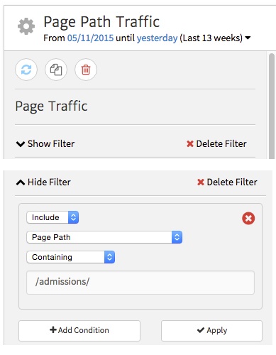
For example, the director of admissions may want to know what pages under the Admissions section are grabbing the most attention, because people browsing this portion of the site are highly likely to be prospective students or parents. He or she doesn’t need to know how many hits the alumni section received, however that information is extremely useful to the director of alumni relations. Fortunately, in Megalytic, you can segment and present the right information to the right people at the right time. To get this data, add the Page Traffic widget and customize it.
If your next presentation is to the Admissions department, within the widget options, select “Show Filter.” Then, enter /admissions/ into the text box, setting the widget to show traffic only from URLs within the Admissions section. Now, apply the filter to update the report and be hailed as a data wizard.
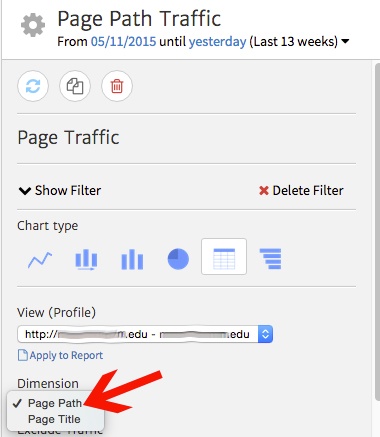
We’ll also change the Dimension to show Page Path instead of Page Title, so we see URLs instead of titles. You can choose either depending on how the site is set up, but for the purposes of this site, it’s more straightforward to identify the pages by showing the URLs.
After all these settings have been applied, you’ll see a list of URLs from the Admissions section of the site, sorted to show those with the most pageviews. Here, we can make some observations as to what information is most appealing to prospective students.

Based on the number of Pageviews, we can gauge the popularity of pages in this section. First, we see that, by far, site visitors zero in on the Tuition and Fees page. Bottom line? Prospective students care most about the bottom line. They (and probably their parents) want to know how much college will cost. We also see multiple pages from the Financial Aid section listed in the top ten, including Scholarships and Financial Aid Programs.
Besides college cost, we can see that Testing Requirements is the second most-visited page, showing that people want to know what tests they’ll have to take and how well they need to score to be accepted into the school. Finally, we see multiple “Apply” pages in the list, showing that many people want to go straight to an application or at least review the application process.
In addition to reviewing overall visit volume, we can also make observations from engagement-related stats. The Scholarships page shows, by far, the highest Average Time on Page at over three minutes. This information suggests that users are taking the time to review the details of scholarship options, proving that this information is valuable on the site and that people will read when it might mean free money.
We also see that the Testing Requirements page shows the highest Bounce Rate, the only page over 70%. This data is a little tricky. It could indicate people are having their needs met and leaving the page or that they aren’t satisfied with the information presented and are looking elsewhere. In either case, this presents an opportunity to provide more specific calls-to-action for individuals to delve deeper into the site and the application process from this page.
Demographic Analysis
Demographic data is crucial to informing a college’s marketing objectives. Target audiences may include students in or just out of high school, transfers, older career changers looking for a degree, and parents of prospective students. Through Google Analytics, you can report on age ranges of individuals coming to the website.
First, make sure you’ve set up Google Analytics to track demographic data on users. Once you’ve been collecting this information, you can integrate it into your reports to offer even more meaningful insights.
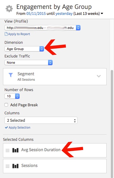
Megalytic offers an Engagement by Demographic widget to help display this information. After inserting this widget, customize it to show data by Age Group and choose Average Session Duration and Sessions for columns.
Once we’ve applied these edits, we can now see a breakdown of engagement by age ranges.
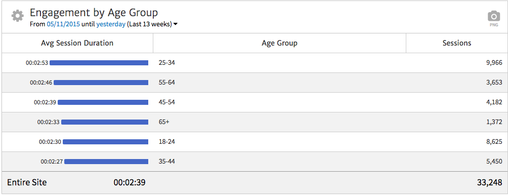
This customization illuminates the fact that the 25-34 age range shows both the most Sessions and the highest Average Session Duration. 18-24 shows the next most Sessions but at a much lower Average Session Duration. From this data, we can extrapolate that while we’re attracting a decent volume of 18-24 year olds, they are more likely to be “skimmers.” Based on the time spent on the site, people in their mid-20s to early-30s may be slightly more serious in researching the school than younger students, or at the very least are reading content more thoroughly. This suggests that perhaps extensive writing should be geared toward an older demographic, but with plenty of bulleted highlights or alternative forms of information presentation for a younger crowd to consume.
In addition, we note high engagement from 45-54 and 55-64 age ranges, as these are more likely to be parents of prospective students. The lowest engagement comes from the 35-44 range, not surprisingly as this group is the least likely to be prospective students and typically not old enough to be parents of potential college students.
Conclusion
While colleges and universities have unique challenges in tracking, reviewing, and interpreting data, many of the standard rules of smart marketing apply. First, know your audience and tailor your reports to the insights and figures those people care about. You can concentrate your efforts on getting the most relevant data points by using some simple widget customizations. Highlight the most useful data points by focusing on the successful completion of action-oriented goals. Examine URL traffic by section and behavior by age, location, or other demographics. Each one of these areas offers a world of valuable insight while opening the door for evaluating on-going strategies.
With this kind of focused data, you can identify strengths and weaknesses in your efforts by channel and also begin to get a deeper understanding of user behavior and your best options for creating messaging that has the desired impact. By incorporating a few simple customizations, your higher education analytics reports can graduate from good to exceptional.

