Changing the Chart Type
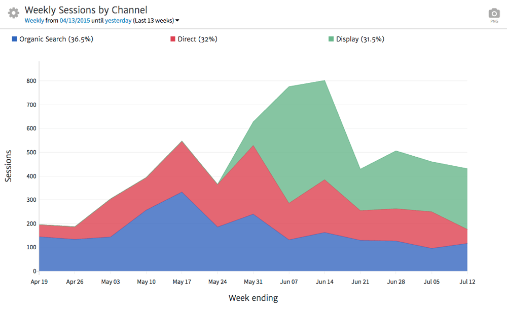
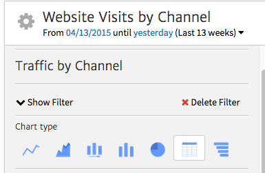
Above you’ll see our data represented using a time series chart. But what if you want to represent data using a different type of graph or a table? For more about choosing the best way to visualize data, see our three-part series on Deciding How to Represent Data. To change how data is visualized in any Megalytic widget, select the “gear” symbol at the top left of the widget, and then choose your desired chart type.
For instance, let’s say you want to show Sessions in a bar chart instead of a line graph. To do this, simply select the corresponding symbol to apply this change to the report.
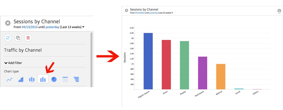
Now, you can see the same data using the new graph format selected, showing all seven Channels that drove traffic over the time period represented.
Changing the Metric
Perhaps you don’t want to show data by Sessions; instead, you want to show a count of Users, or more specifically, New Users. This will help you show your client how many individuals are visiting who have not been tracked as coming to the site before. You can easily change the metric represented in the widget using the “Metric” dropdown within the options.
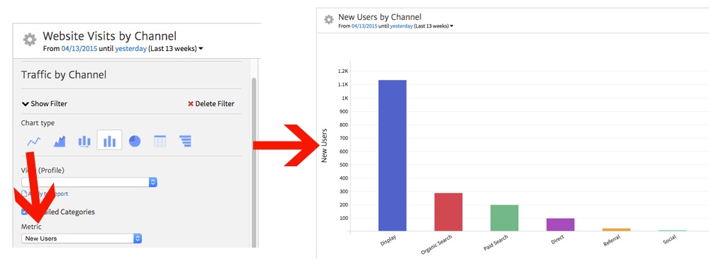
Once you’ve selected the desired metric, it will instantly be applied to the report. Here, we’ve switched from Sessions to New Users, and the change is reflected in the graph once we select the new metric.
Segmenting & Filtering Traffic
By default, this widget shows total website traffic data. However, you may want to show a subset of traffic, for example breaking down mobile traffic by Channel or showing traffic from New York. To slice and dice your traffic, you can use either Segments or Filters.
Applying Segments
You can use the Segment dropdown to select a Google Analytics Segment connected with your account. Note that this can be either a default Segment, created by Google for all accounts, or a custom Segment that you created to get at a specific insight (note: newly created segments may take time to sync with your Megalytic account).
As soon as you’ve selected your desired Segment, it will be applied to the data in the widget. You can also choose “Apply to Report” to apply the Segment to all widgets and affect data across the entire report.

Adding Filters
Perhaps you want to break out traffic in a certain way but don’t yet have a Segment readily available. Filters allow you to, well, filter your Sessions by various Google Analytics metrics and dimensions directly within Megalytic. Note that this built-in Megalytic feature differs from view filters within Google Analytics.
Click “Add Filter” to begin defining the options for your Filter. Next, you can select what metric or dimension you’d like to use and enter desired text to include or exclude.
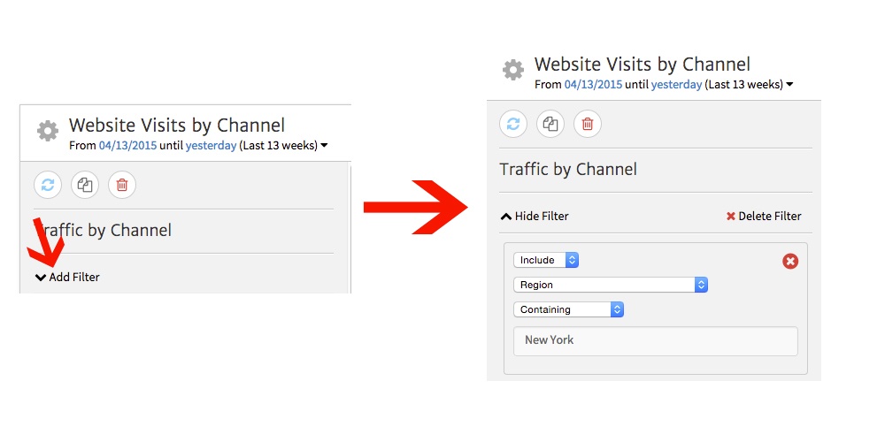
In this example, we want to show only traffic from New York State. So, we select Region (which correlates to state in Google Analytics) from the dropdown and enter “New York” into the text box. Once applied, this filter will ensure that only Sessions from New York are included in the widget’s data.
Changing Text
You want to use names for metrics and widgets that make sense to your clients based on the use case in the report and each client’s level of understanding. Let’s say you want to use a different word than “Sessions” within the widget. For example, maybe you’ve decided saying “Website Visits” will be clearer to the client looking at the report. By clicking the arrow by “Axis,” you’ll see a text box where you can change the label for the Y Axis (the vertical line representing number of Sessions).
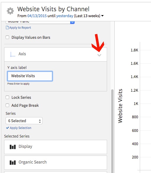
Note you can also change the title of the widget at top by clicking the “Sessions by Channel” text and then entering the new text.
Choosing Channels
Perhaps you want to show only specific Channels in your graph. To select particular Channels, go to “Series” at the bottom of the widget options. Use the dropdown to select the Channels you’d like to represent and click “Apply to Report.”
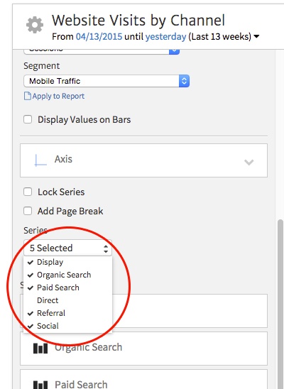
You’ll see a list of Channels currently shown in the “Selected Series” area. Moving on with customization, note that when you’re using a table, you’ll see metrics instead of Channels reflected in the Series section.
Organizing Table Data
By choosing a table to display data, you can show multiple metrics for each Channel. This format can be useful when reporting to detail-oriented clients. For example, you can show not only how many Sessions resulted from each Channel, but how engaged those Sessions were, based on metrics like Avg. Session Duration and Pages/Session.
First, you’ll want to select the table icon to change the chart type.
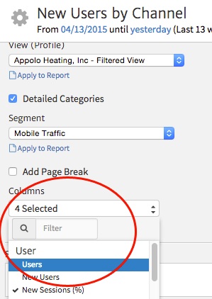
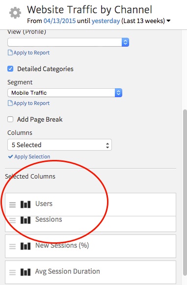
Next, you can customize the metrics you want to include using the Columns dropdown. For instance, say we want to show individuals who have visited the site, not just total Sessions.
Here, we can add Users to the default set of metrics. To do this, we’ll select Users and click “Apply Selection.” Now, the report will add a column for Users.
We can also rearrange the order of columns by clicking the icon at the left of a column and dragging it to the desired place. Here, we’re choosing to make the Users column first in the table.
Finally, note that you can click the text for any of these columns to rename the heading.
Conclusion
As you can see, you can customize the Traffic by Channel widget in many ways to show just the data that matters to your client or boss. From changing the chart type to changing the metric, you can modify your report to represent the data as you want to display it. You’ll find this widget useful for a variety of reporting needs.
For more on customizing widgets and representing data within varying Megalytic widgets, see our Support section.

