
May 20, 2024
The Story Behind AdStage’s Newest Creation: the Calculated Metrics Builder
AdStage Team 6 minute read
One of my favorite tasks in design, and specifically UX design, is taking seemingly complex ideas and organizing them in such a way as to replace that complexity with an intuitive and effective user experience. The fact that the AdStage UX/UI team are often tasked with overcoming such issues means that sometimes existing tools and methodologies just don’t work for us.
The marketing world runs on metrics. Numbers, percentages, and projections are the lifeblood of any marketing team. At AdStage we provide a wealth of data for the digital marketer to allow her to formulate insights into her data, and, when necessary, take action based on that data. Our metrics service pumps out a ton of valuable statistics provided by the various integrations we support, such as Facebook Ads , Google AdWords , and Bing ad data, which we then surface as action triggers in our Automate product, and help the marketer visualize within our Report product using custom tables and charts. This works for a large portion of our customer base, but some marketing powerhouses have formulated their own in-house blends of this data into bespoke metrics that speak more directly to their unique success indicators.
How Calculated Metrics Work
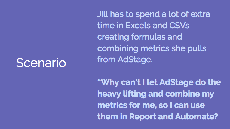
To give an idea of who might use this AdStage feature, and for what, let’s create a persona. Jill is a digital marketer who produces reports for clients. She wants to give her clients an idea of how well their social media campaigns are performing, but in a way that is more meaningful than CTR. She wants to combine “Social Clicks” and “Likes” from Facebook with “Viral Clicks” and “Likes” from LinkedIn.
Until the AdStage calculated metrics formula builder came along, this meant tedious time wasted in Google Sheets or Excel, pulling reports and combining metrics after the fact, then feeding them back into Report. Now, it’s as simple as using the Calculated Metrics Builder UI to construct the custom formula. With all available network metrics at her fingertips, Jill accomplishes in a matter of seconds what she used to waste several hours on each month.
Once the metric is created, she can then use it across all of her AdStage suite of products — using it to streamline her campaign management with AdStage Automate , or creating beautiful custom data-rich PDFs with AdStage Report .
Making the Complicated Simple
To allow businesses to pipe the exact data they need into our ecosystem, we were motivated to create an interface for customers to input the formulas they use to derive their custom metric values. After sampling how other products handle this task, we were left unsatisfied. The interfaces we encountered were by and large unintuitive and ugly, the former being our primary gripe. To fix this issue, we wanted to bake some extra niceties into our solution, and test what different points on the UX complexity continuum would feel like to use.
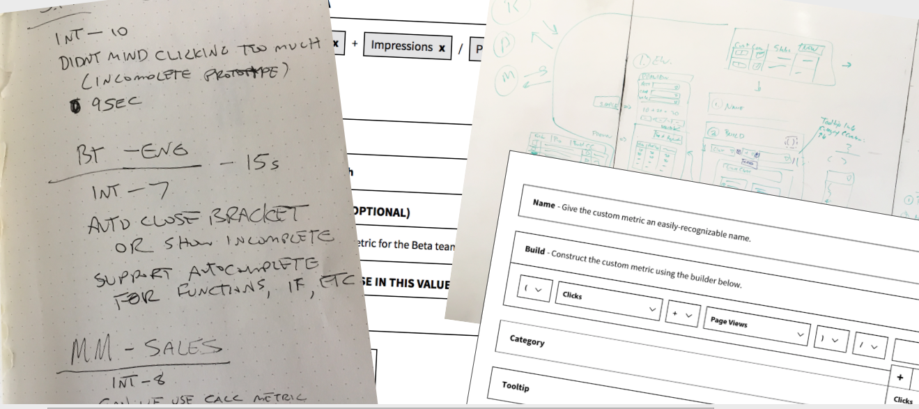 When we felt we had a pretty solid first iteration, we did some user testing. It turns out that our seemingly clever design lost something in translation.
For our first prototype, we considered an approach where dropdowns were the main point of interaction - the user would not have to do any typing, which should lead to fewer mistakes and unintended outcomes. Since this prototype was pretty straightforward, we used InVision to mock it up. When we felt we had a pretty solid first iteration, we did some user testing. It turns out that our seemingly clever design lost something in translation. While not a disaster by any means, the tests definitely showed that some of the conventions we attempted, like an “Add a new metric here” button (represented by a + icon inside a button), which would show on hover of any of the existing dropdowns, was initially confused for an arithmetic operator. This made sense, since a calculated metric formula is obviously made up of a large number of mathematical symbols.
The interfaces we encountered were by and large unintuitive and ugly, the former being our primary gripe. To fix this issue, we wanted to bake some extra niceties into our solution, and test what different points on the UX complexity continuum would feel like to use.
Our Data, Your Way
For the second prototype, we wanted to go completely in the other direction and test an interface where everything could be done by keyboard. This had the added benefit of also being more accessible than a mouse-based interface. However, early on in the prototyping phase, we realized we had hit a dead end, since InVision doesn’t allow keystroke-based artboard transitions. If we wanted to test our idea, we’d need to forego InVision in favor of something more keyboard-friendly.
Conveniently, we have also been undertaking an effort in the Design department at AdStage to centralize and unify our design language and assets. One missing puzzle piece was some kind of bridge between static InVision mockups and full-fledged final UI. It seemed like a real live UI kit without anything more than minimal styling for us at AdStage was an idea whose time had come.
The UI kit continued to evolve to a point where we could prove out our ideas for this project. At that time, we conducted further UX testing to vet our UI design and UX flow. It seemed, from our tests, that we were pretty much on the right track. It was time to turn the wireframed flow into a high-fidelity working component.
At AdStage, we have an in-house unified component library called “Gooey” (a pun on “GUI”). It has all of the basic components you would expect – input fields, buttons, select dropdowns, and the like. We would use these controls to construct our new custom metric formula builder.
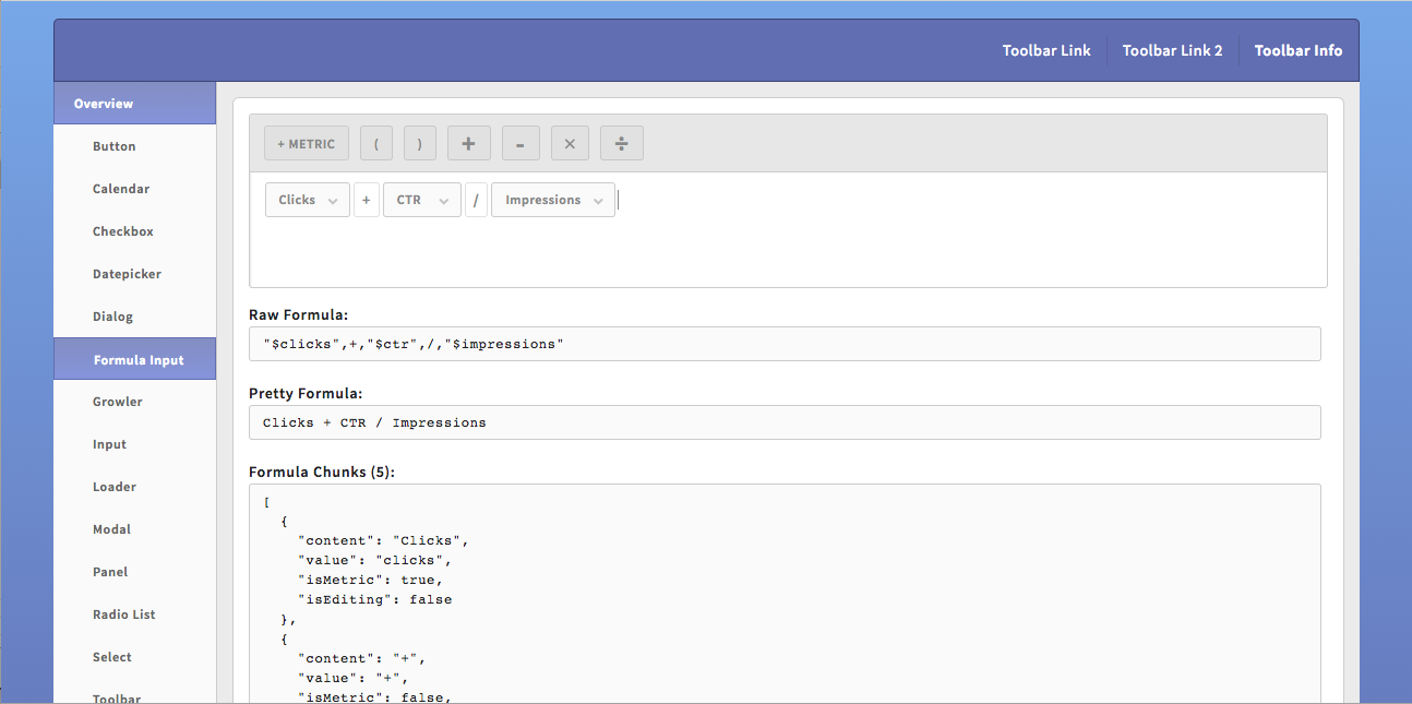
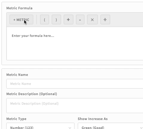
Initially, the formula builder began as a big editable div styled to look like a text area, but referring back to our research, we decided some button-based controls were in order, to help people get started using this powerful new tool. We placed a “button bar” at the top, with buttons for the various arithmetic symbols, as well as a button to show a (searchable) list of the available metrics.
Testing of these improvements showed that most people were actually more comfortable using the buttons to create a formula, at least upon first starting to use the tool. It’s always nice when a seemingly unnecessary improvement actually improves discoverability and usability by a measurable amount.
One thing to mention here is that content-editable divs are not really based on a universally-implemented spec, and are also not very rich in terms of built-in functionality. They come with their own set of peculiarities that some of the biggest names in tech are trying to solve at this very moment. So, needless to say, bending this stunted component to fit our grand vision for a richly-interactive and intuitive component was no small task.
A lot of time was spent getting familiar with Web APIs to try and wrangle the pesky content-editable cursor into behaving less like a five-year-old after downing an entire candy bar, and more like the Queen during a Jubilee: polite and predictable.
At the beginning of the project, we were populating the metrics drop-down menu with a few sample metrics, just to get an idea of how well the process flowed. Once we had vetted that flow, we took the next step of pulling our massive list of metrics into the drop-down. This proved to be ruinous to the experience. We were using our Gooey UI kit dropdown component to power metric selection. It’s based on the really simple logic behind the basic dropdown . However, we found that sometimes the initial paint of the dropdown with all available metrics was taking up to 7 seconds, which is totally unacceptable for any reasonably usable interface. So we set out to find ways to optimize the rendering of the component. One option we had was to only load the first few metrics, which would work because our drop-down component also includes a filtering feature which allows users to search for the metrics they want. So we could load the partial metrics list, and allow the user to search the whole list in the case that the metric they sought wasn’t available within the first page of results.
Another unforeseen challenge was, maybe surprisingly, making sure the cursor always moved and behaved in predictable ways. In traditional text areas, this is all handled by the browser. Not the case in a div (the formula input container) containing other text and divs (the symbols and metrics). We found that in some cases, the cursor would just randomly disappear after selecting a metric. Other times, it would move to the end of input, even if you had just performed an edit in the middle of the formula. A lot of time was spent getting familiar with Web APIs to try and wrangle the pesky content-editable cursor into behaving less like a five-year-old after downing an entire candy bar, and more like the Queen during a Jubilee: polite and predictable. After lots of sweat and perhaps a few tears, we had finally achieved our goal of a pleasurable-to-use component that was also great for the productivity and therefore happiness of our customers.
The calculated metrics formula builder is just one more example of why I enjoy working at AdStage. A seemingly decently straightforward feature that turns out, due to the nature of the web and web standards, to be anything but. From time to time, this can be frustrating, but in the end, we invariably learn far more than we thought we would, and come out the other side of the project with new knowledge and a shiny new timesaving device to bestow upon our faithful customers.
---
The Calculated Metrics Builder is currently in beta. Sign up to get started.